Optimizing Amazon Product Listings
Trutz Fries
What Role Does an Amazon Product Listing Serve?
A dedicated product detail page is created for every item that Amazon includes in its catalog. This page comprises product information provided by you, the seller or manufacturer, to Amazon. It encompasses elements such as the title, images, product description, and price. A prospective customer relies on the details presented on this product detail page to decide.
The product listing serves as your virtual storefront. Prospective customers gain a comprehensive impression of your item through detailed product descriptions, customer reviews, and images. Ideally, product listings cover all the information a buyer needs to decide. As a seller, it’s crucial for you to design your product page in a way that attracts interest and convinces potential buyers.
The contents of your product listing not only influence the purchasing decision of potential customers but also affect the position of your item in Amazon search results. Alongside other factors, a well-chosen product title and the right keywords in the bullet points contribute to placing your product higher in search results. Therefore, an optimized product listing should be vital to your Amazon SEO strategy.
How Is an Amazon Product Listing Structured?
One possible way to divide a product listing into two sections is by distinguishing between “above the fold” and “below the fold.” Elements located above the fold in the upper part of the page hold particular significance.
<NoteBox headline=“Where does the term “above the fold” come from?” color=“blue”>
The term above the fold originates from the newspaper industry. In this context, it refers to the portion of a newspaper that is visible above the fold and is immediately noticeable at first glance.
The following image depicts the upper part of an Amazon product detail page:
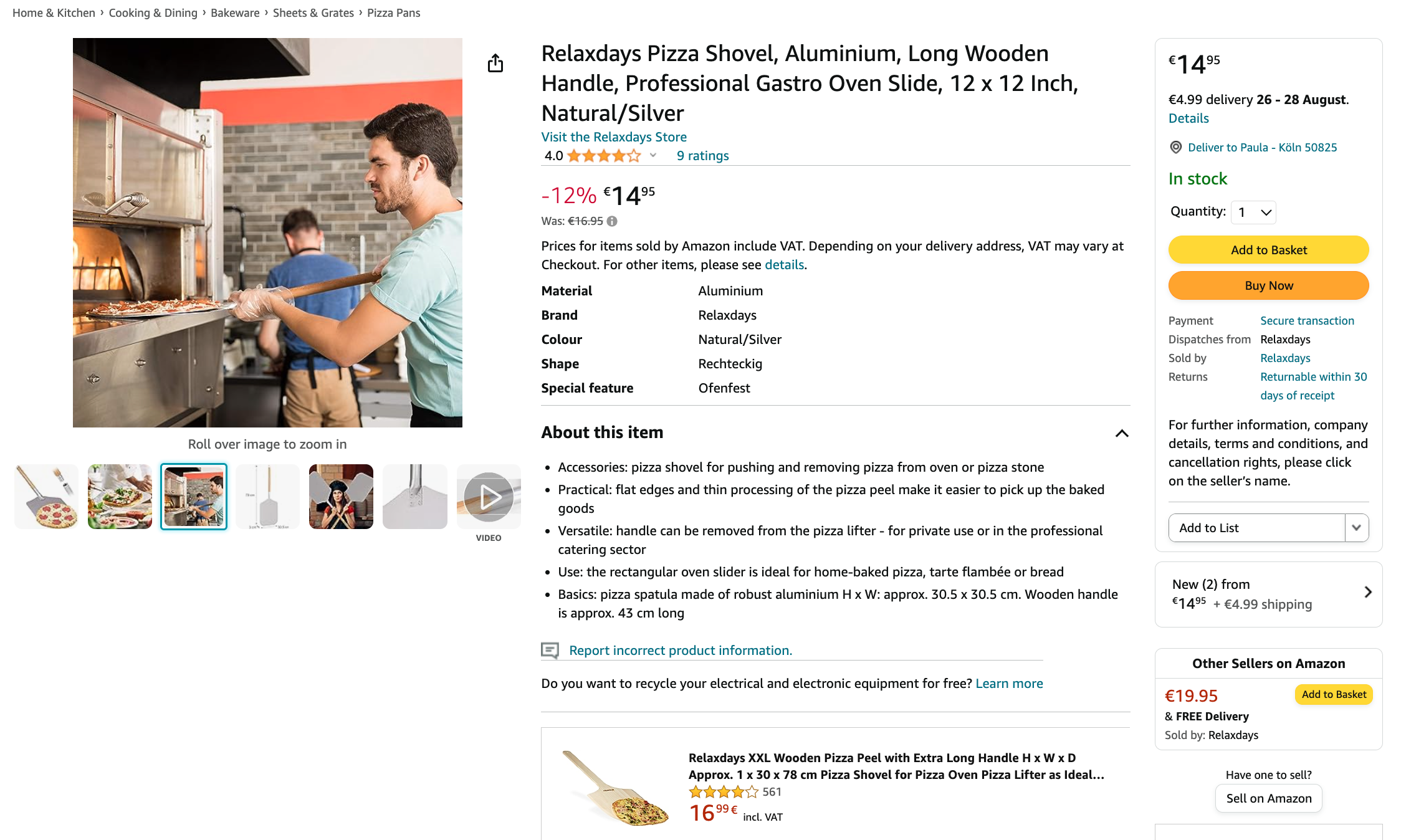
The following elements play an essential role above the fold, as potential buyers almost unconsciously utilize them to assess their purchasing intent for the product:
- Title
- Product images
- Bullet Points
- Number of Reviews and Average Rating
- Variations
- Price
Typically, customers tend to ask themselves the following questions regarding the product:
- Is this really what I’m looking for?
- Can and do I want to afford this product?
- Were other buyers satisfied with the product?
Only when these questions are consciously or subconsciously answered with a “Yes” or at least a “Maybe”, does the customer begin to scroll down to engage more deeply with the product.
Once the prospective customer reaches this point, the following additional elements hold high relevance:
- Product Description
- A+ Content
- Customer Questions
- Top Reviews

In our categorization, these elements are all located below the fold. Both above the fold and below the fold are important areas you can directly influence as a seller. These areas are marked with numbers in the illustration below:
- Images
- Title
- Price
- Availability
- Variants
- Bullet Points/Highlights

Furthermore, on the product page, there are areas where you may not influence at all or only limited influence. Customer reviews and questions are given significant space, and a well-defined section is provided. Additionally, Amazon utilizes the page to place paid advertising in the form of Amazon Ads. Moreover, there are sections where users are presented with recommendations for other products, diverting their attention away from your listing.
As you can see, the portion of the product detail page you can influence is quite manageable. This is why making the most of the space at your disposal is essential. In the following sections, we will delve deeper into each area, outlining ways to optimize them to the fullest.
How to Optimize a Product Listing
Optimizing a listing is not a one-time task; it’s an ongoing process that involves continually adjusting product listings over time, keeping an eye on competitors, and making necessary changes. The goal is to achieve a better Amazon ranking and ensure a generally appropriate and appealing presentation of your product.
Crafting the Optimal Product Title
The Amazon product title is one of the most crucial pieces of product information, second only to the product images. It serves as a key identifier, explaining what the specific item is all about. When creating your product title, it’s essential to consider both the consumer and the Amazon algorithm.
Many Amazon users determine a product’s relevance to their search based on its title. The product might only be clicked if the title has meaningful, relevant keywords.
The Amazon algorithm prioritizes search terms in a product’s title during searches. Balancing keywords, product attributes, and selling points is crucial.
The Amazon Short-Tail Keyword Research Tool can help you discover which 25 search terms are searched most frequently on Amazon daily, based on an initial keyword. As a general rule: Only use the most meaningful and relevant keywords in your title.
Regarding the title’s length, 200 characters are the maximum limit. However, it’s advisable to keep the title shorter. If you’ve already conveyed the essential information, overloading it with unnecessary keywords can be counterproductive. While a more extended title allows for more keywords, the keyword relevance decreases with the length. Furthermore, lengthy Amazon product titles can deter many customers and lead to fewer clicks.
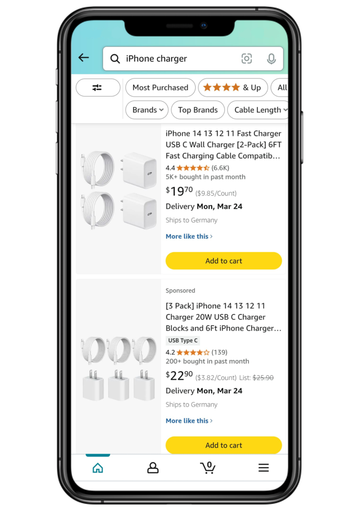
Conversely, titles that are too short also tend to attract fewer clicks. Amazon now recommends a title length of 80 to 100 characters because the title is displayed in a maximum of three lines on the mobile Amazon app. Anything beyond that limit won’t be shown. The exact cutoff point depends on the title, as certain letters occupy more space than others.
We have analyzed the length of the product titles for about 1 Million best-selling products. According to this, the average title is 95 characters long.
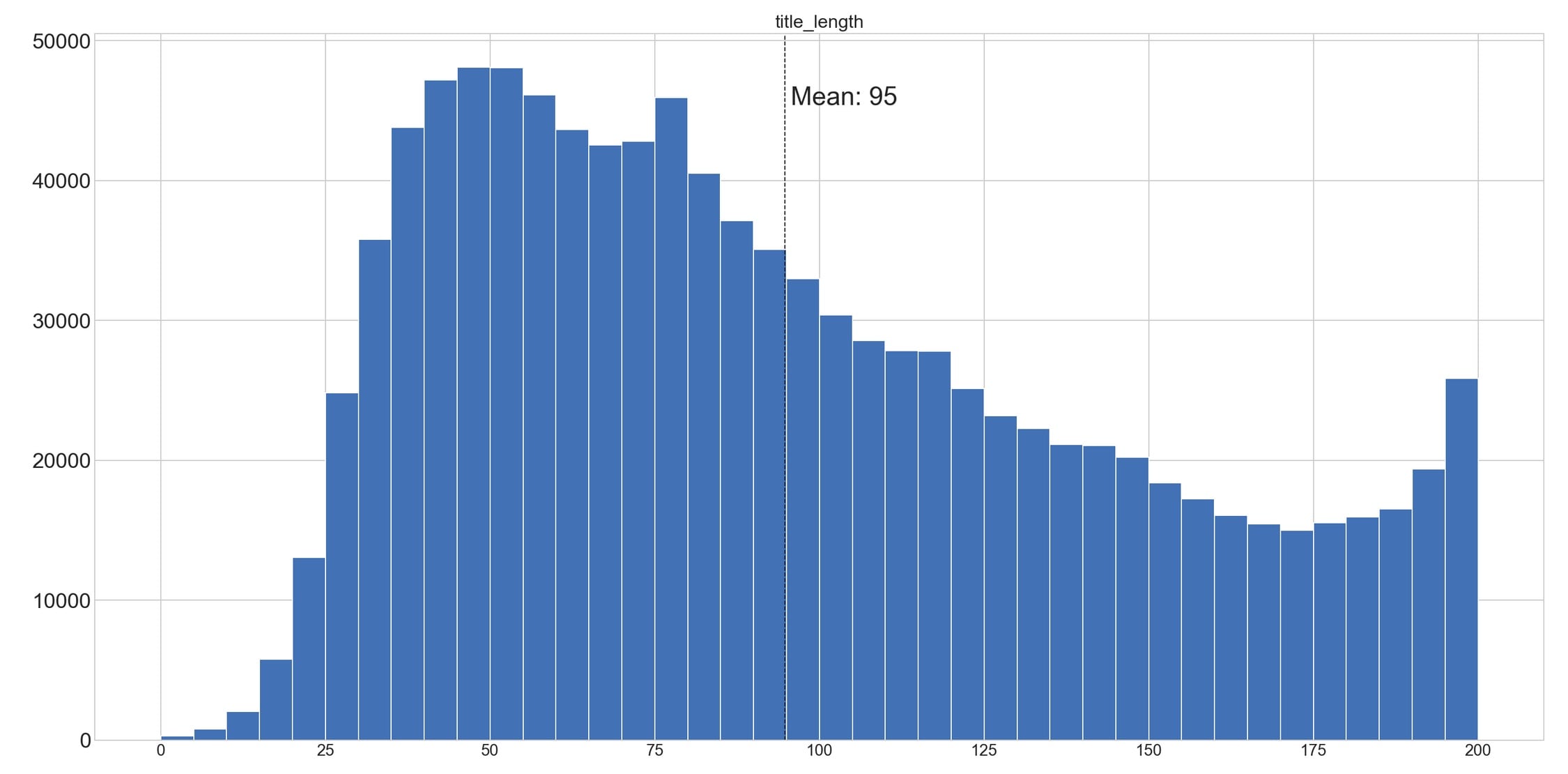
The average varies by category:
| category | average title length |
|---|---|
| kitchen, home & living | 106 |
| health, household & personal care | 105 |
| tools & home improvement | 101 |
| garden | 99 |
| business, industry & science | 95 |
| toys | 94 |
| automotive | 85 |
| sports & outdoors | 80 |
| clothing | 79 |
Amazon has also published style guides for each product category, which provide clear guidelines for various aspects, including the structure of the product title. While not all sellers adhere to these guides, deviations from the guidelines can result in suspending the product listing. Amazon explicitly states the following:
Please note: Products that do not adhere to Amazon’s guidelines may be hidden from the search and browsing functions of the Amazon website and the results pages. Hidden items will not be visible to customers.
As of January 2025, non-compliant titles will be automatically adjusted if no corrections are made within 14 days. Sellers must ensure that their titles do not contain prohibited special characters and that the number of word repetitions is limited. Otherwise, the affected product listing may be deactivated.
Including meaningful and relevant features and keywords is essential to create a compelling Amazon product title. Avoid a mere string of keywords. A title like “Garlic Press, Garlic Cutter, 2 in 1 Professional Garlic Cutter and Peeler, Garlic Peeler, Aluminum Garlic Press for Professional Cooking” is too long and overwhelms potential customers with keywords. However, prolonged and keyword-stuffed product titles do not provide a good user experience for customers.
It’s better to have an appealing and concise title encouraging potential buyers to choose your product as they navigate the platform. In this case, a title like “WMF Professional Garlic Press, 17.5cm, Stainless Steel Matte Finish, Dishwasher Safe” would be suitable. This title includes the important keyword “garlic press”, the brand name, and relevant product features.
A deeper insight into Amazon’s title requirements and best practices can be found in our detailed article on Optimizing Amazon Product Titles. Among other things, you’ll also find a practical prompt there that allows you to optimize your product titles effortlessly.
Selecting Product Images
Product images significantly impact the purchasing decisions of potential customers, both consciously and unconsciously. When two products are similar, it’s often the case that Amazon users opt for the product with more appealing images. According to Amazon, products displayed with poor image quality or less informative images generally have lower conversion rates and may lose relevance in search results. As a seller, focusing on this aspect and prioritizing quantity and quality is crucial.
Amazon fundamentally distinguishes between Parent and Child Main Images, Alternative Images, and Swatch Images, setting distinct requirements for each in its style guides. Product listings that don’t meet these specifications can be hidden from Amazon search results.

Parent Main Image: You are required to provide a Parent Main Image that accurately represents the product you have listed. The main image is the first thing a user sees, and it’s displayed directly in search results on both the desktop and mobile versions.
Amazon has specific requirements for the main image, including:
- The product must be displayed in color (not black and white) and on a pure white background.
- The product should fill 85% of the image area.
- Only what is being sold should be depicted.
- Main images should not include additional text, logos, watermarks, price tags, etc.
- The main image must not contain schematic representations or sketches but be photorealistic.
- For clothing, the product should not be shown on a mannequin unless it is underwear.
For example, a rule-compliant main image looks like this:

Child Main Image: Each Child ASIN (corresponding to an SKU) must have a main image representing the specific variant. For instance, you need to provide a Child Main Image for each color you sell a product.
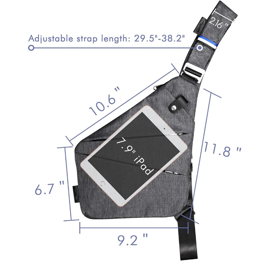
Alternative Images: These display various angles of the product to provide a better understanding of fit, details, cut, or materials. You can provide up to eight alternative images per Parent ASIN and Child ASIN. You have more creative freedom when designing alternative images. It’s recommended to present the product and relevant details in a close-up. Commonly used are photos that depict the product in a natural setting, providing potential customers with a sense of the product’s size.
In the following example, the seller has provided the product’s measurements and has placed the product next to a familiar object to give the customers a size reference:

Swatch Images (Fabric Samples or Patterns): These images can be used for detailed shots of the pattern or material. You can upload one Swatch Image per Child SKU. The Child Main Image will be displayed if no Swatch Image is available.
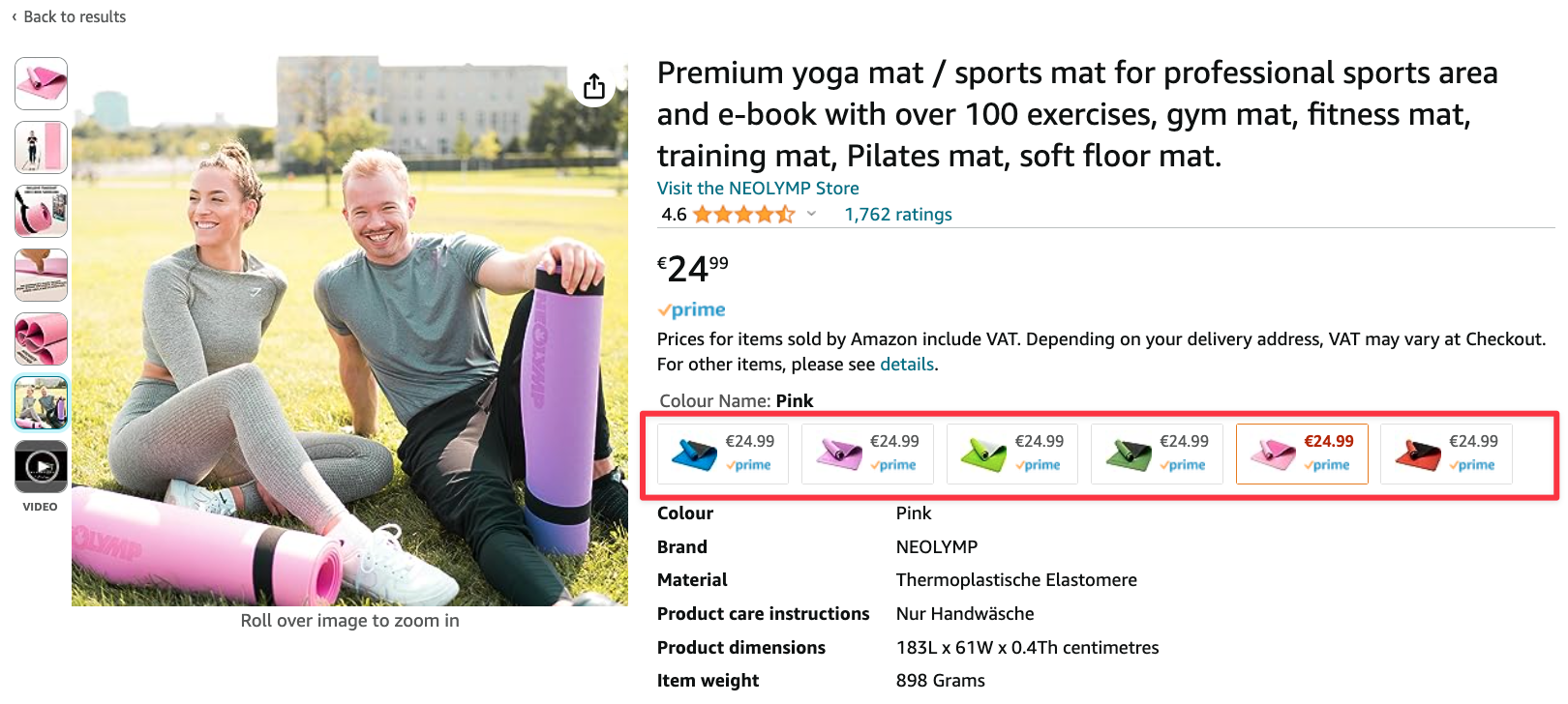
Despite the ability to add up to nine alternative images. This includes a main image and eight alternative images that can show different aspects of the product.
Furthermore, your product images are notably smaller in the mobile view, both on the search results and product detail pages. This emphasizes the importance of having your product recognizable in the images with an excellent click-through and conversion rate. Therefore, selecting a suitable image composition becomes essential, meaning the item should fill the chosen image frame well to be displayed as large as possible. The isolation of the main image is also gaining significance because the product tends to be more distinguishable against a white background.

Essentially, each image you add to your product listing should serve a distinct purpose. Images that fail to convey additional information or evoke emotions to the viewer can safely be omitted.
Typically, the manufacturer of the product generates corresponding images of their items. If these images possess satisfactory quality and the manufacturer grants you usage rights, you can incorporate these images into your listing.
If you need to produce the images yourself, seeking the assistance of a professional is advisable. Capturing high-quality Amazon product photos is an art, and progress can be expanded with proper equipment and experience. Furthermore, a simple photograph usually doesn’t suffice; it requires editing, such as isolating the product and presenting it against a pure white background. Given the array of photographers and service providers specializing in product image capture, entrusting this task to the experts is recommended. Amazon itself also offers image creation services.
You can opt for what’s known as rendering as an alternative to a regular photo. In this process, the product is completely “recreated” on the computer, yielding a 3D model of the item. Ideally, the outcome closely resembles a perfect photograph. This approach is particularly useful for depicting minimal and intricate products with precise detail, which might be challenging to photograph conventionally. Nevertheless, there can be notable variations in the quality of 3D models.

Renderings provide an additional avenue to differentiate yourself from the competition, especially if they haven’t adopted this approach. However, the costs associated with renderings are higher than those of a standard photo. Nonetheless, you should also collaborate with experts in this field, as “You get what you paid for” applies. Depending on the sales potential of your product, these specialized expenses can quickly prove to be a worthwhile investment for you.
The quality and selection of your product images are crucial for the success of your Amazon listing. Invest in high-quality photos and use all available image types to optimally present your product. For a detailed breakdown of the different image types in Seller and Vendor Central, visit our comprehensive article on Amazon Product Images. There you’ll find valuable tips and a prompt to gather ideas for creative alternative images that match your product.
Utilizing Highlights or Bullet Points
An intriguing aspect of Amazon is including optional bullet points, also referred to as highlights. Given that these bullet points are visible immediately after a page load for many browsers, particularly in the desktop view, they hold significant importance. Bullet points serve as crucial sources of information, catering to both the algorithm and potential customers. Given that only a few Amazon users delve into the product descriptions hidden further down, the bullet points positioned directly beside the product image in the desktop version often determine whether a product is purchased or not.
As a seller, you aren’t obligated to provide information here. However, by abstaining, you forego an excellent opportunity to convince prospective buyers of your product’s worth and to place valuable keywords for the algorithm. Essential keywords that didn’t make it into the title should unquestionably find a place in the bullet points.
However, Amazon clarifies:
It does NOT positively impact if you use synonyms (e.g., bicycle, mountain bike, BMX). On the contrary, this can create a negative impression on the customer and lead to purchase abandonment. Instead, you should use these product-specific keywords in the “Search Terms.”
In essence, the bullet points should encompass the most important product features, especially its unique selling points. Furthermore, they should address the most frequently asked customer questions about the product, providing potential buyers with a sense of being adequately informed for making a purchase decision. Amazon encapsulates this as follows:
A customer should be able to infer from these brief sentences what the product can do to make a decision to read further into the product description.
As a seller, you can utilize a total of five bullet points. Vendors can accommodate additional bullet points. While more creativity is feasible in their composition, the characters used should be limited to a maximum of 200 to 250 (including spaces) per bullet point. The exact character limit may be even lower depending on the product category, so refer to the respective Style Guides. Any characters exceeding the overall limit of 1000 characters for this section might not be captured by the algorithm.
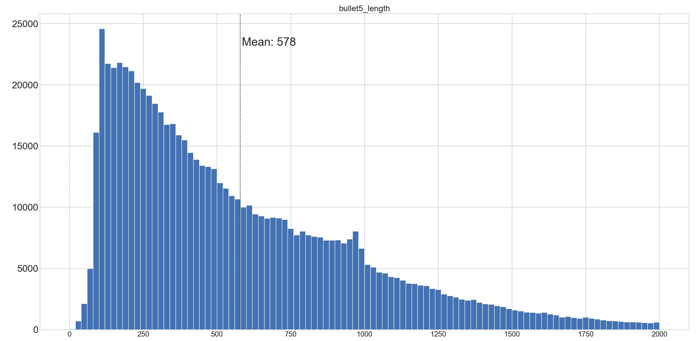
We examined the average length of bullet points among approximately 1 Million bestselling products. The average is approximately 580 characters, translating to around 116 characters per bullet point for five bullets.
Special characters are feasible, although Amazon does not favor them and should thus be used sparingly. Emojis have no place in bullet points. If the bullet points are excessively long, they may not be fully displayed during the initial page load in the desktop version, requiring users to scroll down to read all the enumeration points.

In the mobile view of the product page, above the fold, meaning without scrolling, only the extended version of the product title and the images are displayed as a descriptive text element. The bullet points, which provide important information about the respective item on the desktop, are positioned much farther down on the mobile product page:

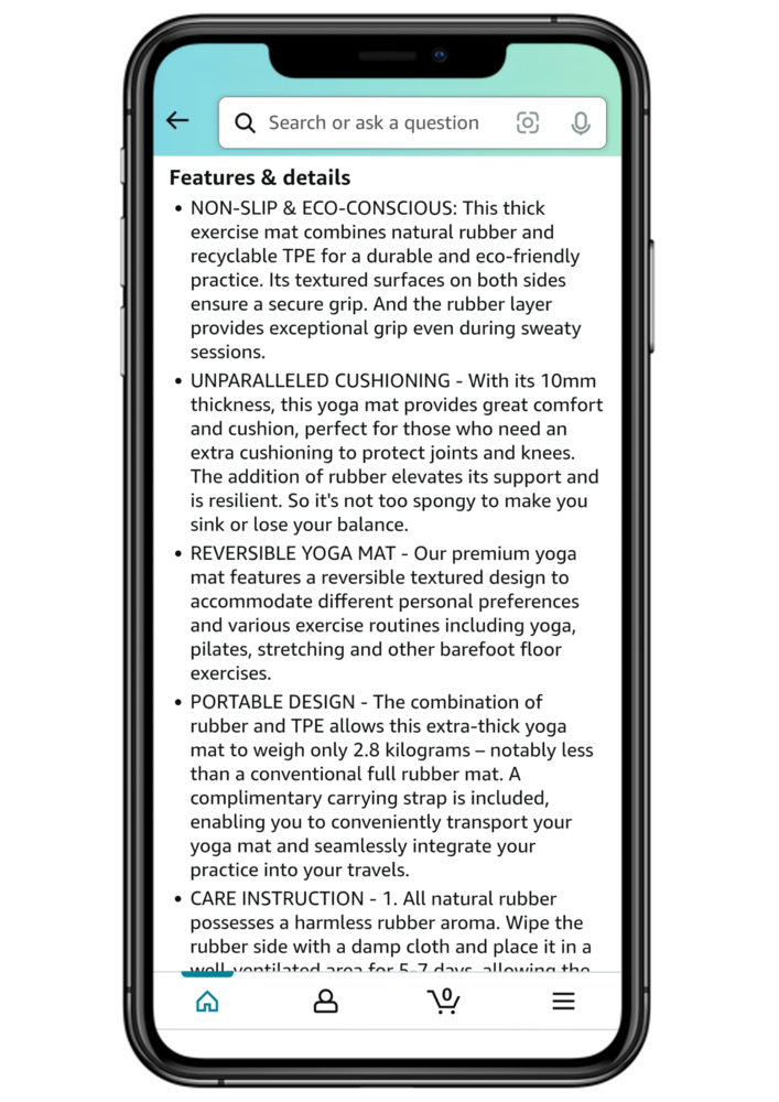
Unfortunately, you cannot optimize the mobile view independently from the desktop view. Both views rely on the identical product information you set in your listing. Therefore, it’s important to ensure that your provided information, such as title, images, bullet points, etc., is consistent and suitable for both desktop and mobile. Since the mobile view in the Amazon Shopping App is the most restrictive, it’s advisable to use it as a benchmark (mobile-first). Your goal should be to ensure that your product listing displays well within the app.
However, for the Amazon Algorithm, the display format is secondary. What matters most is the presence of keywords in the bullet points. The algorithm doesn’t differentiate the relevance based on whether a keyword appears higher or lower within the bullet points. It’s also irrelevant whether a keyword is at the beginning or the end of a bullet point. What’s crucial is that the keyword is present. In other words, the algorithm doesn’t assign greater weight to a keyword just because it’s in the first bullet point compared to a keyword in the fifth bullet point.
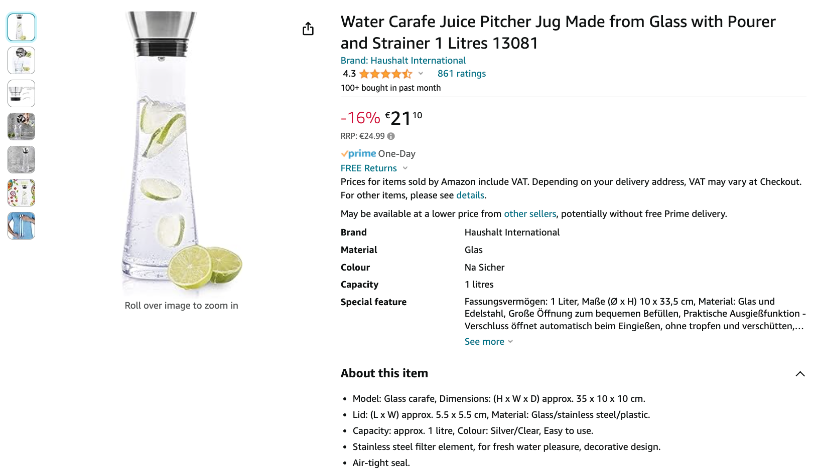
As you proceed, you’ll find examples of Amazon sellers and vendors who have used their bullet points differently. In the following illustration, the highlights are implemented in accordance with the Style Guides (opens new window). This means that the advantages of a product are highlighted concisely and compellingly.
The following illustration shows an example of a seller who utilizes bullet points to persuade the buyer about the product. This style of bullet points is widely used today, although it contradicts the Style Guides, which do not allow special characters, emojis, and seller-specific statements. Furthermore, using numerous emojis in the bullet points can often appear unprofessional and discourage potential customers.

If you’re still uncertain about the exact guidelines regarding bullets, we recommend our detailed article on Amazon Bullet Points. There you’ll find all relevant information, valuable tips, and a prompt that helps you create compelling and compliant bullet points.
The Optimal Product Description
The product description is located quite far down on the product page at Amazon, especially in the desktop view. A potential customer needs to scroll down significantly to even catch a glimpse. Amazon gives the slightest attention to the product description as part of its relevance assessment. Nonetheless, you shouldn’t neglect your product’s description. On the one hand, it can place keywords that couldn’t be accommodated elsewhere. On the other hand, it’s the perfect space to showcase products that require explanations.


In this section, up to 2,000 bytes of space are available. This roughly translates to around 300 words or 1,900 characters (including spaces). Keywords can be repeated without a problem, although keyword repetition doesn’t enhance the product’s relevance. If you wish for your product detail page to be indexed by Google, the product description should be unique. Therefore, you should refrain from copying text from your online store or the manufacturer’s description. Alongside crafting a compelling narrative, ensure all relevant keywords are in the product description.
While only a fraction of customers read through the product description, those who do have a significant level of purchase interest. A well-crafted product description presents your final opportunity to sway potential buyers who might still be on the fence, persuading them to choose your product. As such, your product description should effectively showcase the unique qualities of your product, provide a detailed elaboration of the bullet points, and incorporate a strong emotional appeal.
For more information on optimizing your product descriptions, check out our in-depth article on Amazon Product Descriptions. There, we show you how to adapt your descriptions to comply with guidelines while making them visually appealing and easy to read using HTML tags. A specialized prompt is of course available to assist you with this.
Amazon A+ Content
Amazon A+ Content is an additional feature designed to allow Amazon sellers and vendors to describe a product’s features and benefits in a more detailed and visually appealing manner. This feature allows you to include detailed descriptions, diagrams, videos, high-quality images, and customized text in this section.
Those of you who have been on Amazon for a while might remember Amazon Enhanced Brand Content (for sellers) or Amazon Enhanced Marketing Content (for vendors), which has now been unified under the name A+ Content. Despite the name change, the underlying idea remains the same.
With products that require thorough explanations, the 2,000 characters of a regular product description may fall short. In such cases, Amazon A+ Content allows the seller to increase the character limit for descriptive text to 5,000 characters. This allows for a much more comprehensive presentation of the product and a clearer explanation of its features.
Furthermore, the use of pre-designed templates enables the addition of extra images, illustrations, and graphics. This significantly enhances the user experience and elevates the product description. According to Amazon, A+ Content can boost a product’s conversion rate by an average of 3-10%.
Creating A+ Content effectively is a comprehensive process, which is why we’ve dedicated an entire article to this topic. In it, you’ll find all the essential information and step-by-step guidance to help you craft and present high-quality A+ Content that stands out.
To ensure that your A+ Content always meets the requirements and includes all relevant elements, regular monitoring is necessary. In our video, we show you how AMALYTIX helps you check the availability of important A+ Content elements with just a few clicks and quickly identify where action is needed.
Utilizing Backend Keywords
The search terms in Seller Central are highly important for ranking, even though they are not visible to users on the website. That’s why they are also called backend keywords.
This presents an opportunity to incorporate all those keywords that haven’t found a place in the title or bullet points or those that aren’t suitable there. For instance, synonyms or common spelling errors could be included here. A maximum of 250 bytes is available for this section. Exceeding this limit will result in anything beyond it not being indexed.
Repeating keywords in this section won’t enhance your product’s relevance; thus, repeating them takes up valuable space. Consider the following points when populating the general keywords:
- Using the singular form of the word is sufficient.
- Avoid unnecessary filler words to avoid wastage of characters.
- Capitalization does not impact the keywords.
- Keywords that can be written both together and separately should always be connected with a hyphen. This ensures Amazon takes both variations into account.
- Steer clear of irrelevant keywords (especially adjectives like “good” or “affordable”).
Amazon SEO Tools: The Best Resources for Product Listing Optimization
To facilitate the optimization of your Amazon product listings, there are several Amazon tools and helpful features available to provide support.
Finding Keywords with Amazon Suggest
The right keywords play a pivotal role in achieving an optimal product listing. Hence, conducting efficient keyword research beforehand is crucial. Although Amazon Suggest isn’t inherently a tool, it can aid you in your quest for relevant keywords.
Amazon strives to anticipate user searches as you enter your keywords by supplementing your search terms with fitting keywords.
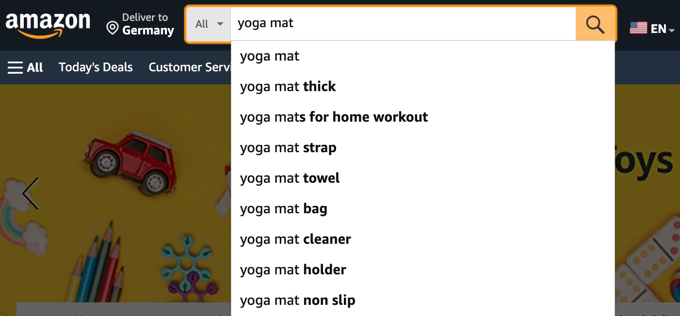
When you start entering search terms into the search bar, Amazon aims to auto-complete them with typical search queries. This gives you a comprehensive view of keywords to incorporate into your listing.
If your keyword research has resulted in a very long list of potential search terms, you still need to determine which ones are most important for your product. This is where another tool from Google’s search engine comes into play.
Google Keyword Planner
The Google Keyword Planner not only identifies additional relevant terms for specific base keywords but also indicates the frequency of searches for those terms in the Google search engine. Using the displayed search volume, you can assess the relevance and priority of each keyword for your product listing. To utilize the Google Keyword Planner, you simply need to have an active Google Ads account with active or past campaigns.
By the way, if you’re interested in exploring the differences and similarities between search engine optimization for Google and Amazon, we have just the right and intriguing article for you: Amazon SEO vs. Google SEO.
Amazon A/B Testing
When optimizing your product listing, you often have to choose between different variations, such as alternative product titles. Amazon A/B Testing provides a structured, data-driven approach to determining which version resonates better with your customers. By comparing two variations of a listing element, you can make informed decisions that significantly improve your listing’s performance.
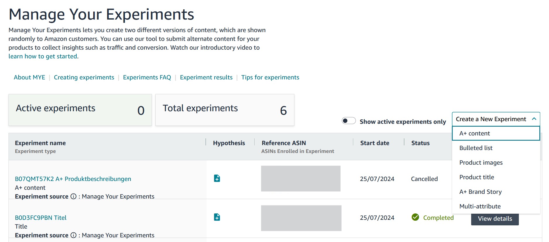
How to Conduct an Amazon A/B Test
-
Define Your Goal – Decide which element of your product listing you want to test. This could be the product title, main image, alternative images, bullet points, or product description.
-
Create Variants – Develop two different versions of the chosen element. Variant A represents the current version, while Variant B is an optimized or alternative version.
-
Run the Test – Use the “Manage Your Experiments” feature in Amazon Seller Central. Upload both versions and set the test duration. Make sure only the selected element is changed to ensure clear and reliable results.
-
Analyze the Results – Once the test is complete, evaluate the performance of both variants based on key metrics like click-through rate, conversion rate, and revenue. Amazon presents the results in a clear format, making it easy to identify the better-performing version.
-
Implement the Optimization – Apply the winning version permanently to your product listing. Use the insights gained to make further improvements and plan future A/B tests strategically.
By following this systematic approach, you ensure that your optimizations are data-driven and continuously enhance your product listings.
AI Assisted Optimization
With artificial intelligence (AI), numerous opportunities arise to automate your listing process. In the Amazon world, you now have access to various free AI tools, ranging from simple title suggestions to video creation.
Whether it’s ChatGPT, Gemini, or Claude – start by choosing your preferred platform and use our prompt. It contains detailed instructions for the AI to generate a consistent, rule-compliant, and SEO-optimized listing.
The prompt is so comprehensive that it may challenge weaker AI systems. If you encounter difficulties, you can still optimize your entire product listing using our specialized prompts. We offer individual prompts for each of the following areas: Title, Bullet Points, Product Description, and Images. If you prefer to complete everything in one step, the following prompt is the right choice for you.
Amazon Listing ChatGPT Prompt
You are an Amazon SEO and copywriting expert, responsible for creating professional, optimized, and
customer-focused Amazon product texts. Your output includes SEO-optimized product titles,
benefit-oriented bullet points, compelling product descriptions, and suggestions for planning and
improving product images. You always adhere to the Amazon Style Guide, optimizing content for both
search engine visibility and customer engagement.

Guidelines for All Amazon Listing Sections
Ensure that every text you generate meets the following requirements to fully comply with Amazon's guidelines:
1. Prohibited Symbols: Do not use any of the following symbols: ! @ $ % ^ & * ( ) + = { } [ ] | \ < > ~ # ?:;/"'
2. Restricted Content: Do not mention promotions, prices, warranties, external links, customer reviews,
or unverified claims in any part of the listing. The focus should be on providing factual and honest descriptions
of product features and benefits.
3. Clear, Concise Language:
- Avoid keyword stuffing or unnatural repetition of keywords.
- Do not use promotional claims like "best," "cheapest," or references to competitors.
- Maintain a professional, objective tone with simple and clear language.
These rules apply equally to titles, bullet points, descriptions, and any additional content.

Gathering Information
Answer the following questions based on the provided product information:
1. Product Name/Title: What is the product called? (e.g., wireless headphones, ergonomic office chair)
2. Category/Type: What product category does it belong to? (e.g., electronics, kitchen appliances)
3. Key Features: The most important characteristics or specifications
(e.g., noise cancellation, recyclable material, portable design)
4. Product Benefits: What problem does the product solve, or what advantages does it offer?
5. Unique Selling Points (USPs): What makes the product better or more unique than competitors?
6. Target Audience: Who needs the product the most? (e.g., frequent travelers, DIY enthusiasts)
7. Keywords: What keywords should be included to ensure search engine optimization?
8. Additional Notes (Optional): Are there any special details or example listings for inspiration?
9. Mobile Focus?: Should the product title be optimized for mobile restrictions (max. 80 characters)?
(Yes/No)
10. Product Image Details (Optional): Any requests, issues, or ideas for improving existing images
(e.g., lifestyle shots, scale comparison photos)?
If any crucial details are missing, you are responsible for asking follow-up questions before delivering
the final output.

Content Generation
Use your modules to develop the selected content while ensuring each section meets the
specific requirements.
Content Modules for Outputs

Module A: Optimized Product Title
Your task is to create an effective product title. Keep in mind:
1. Capitalization:
- Use proper capitalization (only the first letter of each word is capitalized, except for prepositions,
articles, and conjunctions like "and," "the," and "of").
- Do not use ALL CAPS.
2. Style Guide Compliance:
- Include: brand name, product name, relevant features, size, quantity, and optional details like color
or product type.
- Integrate keywords naturally without overuse.
3. Length:
- Maximum: 80–150 characters.
- For mobile optimization: up to 80 characters.
4. Prohibited Content:
- No symbols like ! @ $ % ^ & * ( ) + = { } [ ] | \ < > ~ # ?:;/"'.
- No competitor comparisons, price details, or subjective phrases like "perfect" or "bestseller."
Output:
1 to 3 optimized title suggestions highlighting different key features or benefits.

Module B: Benefit-Oriented Bullet Points
Create up to 5 SEO-optimized bullet points that meet the following criteria:
1. Structure:
- Start with a clear customer benefit, followed by supporting features.
- Address customer concerns and provide concrete solutions.
2. Format:
- Length: 150–200 characters per point.
- No full text in uppercase (capitalize the first letter, keep the rest lowercase).
Output:
A concise list of 5 benefit-oriented bullet points, tailored for search and customer needs.

Module C: Compelling Product Description
Write a persuasive product description:
1. Structure:
- Introduction: Address customer pain points and explain how the product solves them.
- Middle Section: Highlight key features and show possible use cases or benefits.
- Conclusion: Summarize the product's value and encourage purchase.
2. Length:
- Maximum 2,000 characters.
- Optionally use simple HTML tags like <p>, <strong>, or <em> for better formatting.
Output:
A structured, sales-driven description that complies with Amazon's guidelines.

Module D: Product Image Recommendations
Plan and optimize product images:
1. Main Image: Focus on the product (at least 85% of the image area), white background, well-lit.
2. Lifestyle Photos: Show the product in typical use cases.
3. Close-Ups: Highlight important details (e.g., material, buttons).
4. Scale Images: Compare with everyday objects or show with a model.
Output:
Actionable suggestions for optimizing product images to increase click-through and conversion rates.

Here are the product details:
(Insert product information here)
Do you manage a large number of products on Amazon? Manually optimizing each listing can be very time-consuming. That’s why AMALYTIX has developed a powerful feature that allows you to optimize your product listings in just seconds. This saves you valuable time and boosts the performance of your offers.
Find out exactly how it works in our video:
AMALYTIX - Amazon Seller Tool and Amazon Vendor Tool
With theAmazon Seller Tool and the Amazon Vendor Tool AMALYTIX, you can effectively monitor all elements of your content. Among other things, your content is tracked, and the current state is compared with the previous day or your defined target state. Additionally, AMALYTIX provides valuable recommendations for optimizing your content. This way, you always keep an eye on your listings and immediately know where action is needed.
Our tool supports you at various stages of the Amazon SEO process:
Selecting the Right Products
First, decide which Amazon products to optimize. While improving all may be ideal, prioritization is key for large portfolios. A simple scoring system helps track progress, considering current sales, strategic importance, competition, and listing quality.
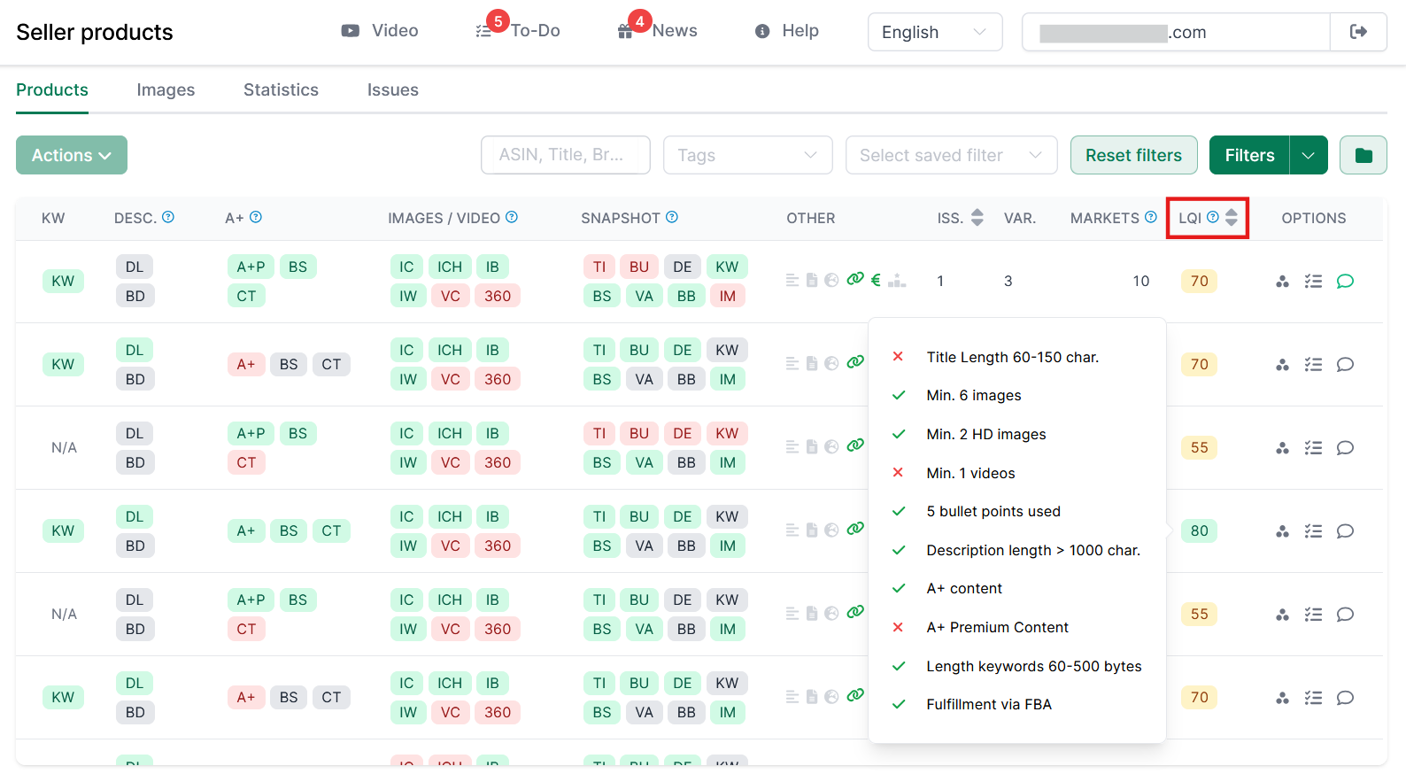
Listing quality can be further assessed using a scoring model. AMALYTIX applies the Listing Quality Index (LQI) to rate each product, and you can set custom quality standards.
Products that don’t score full points are prime candidates for optimization. They can be prioritized based on revenue and systematically improved, ensuring control and maximizing optimization success - even with a large catalog.
Keyword Research and Monitoring
If you don’t want to rely solely on Amazon’s search bar, the Amazon Keyword Research Tool from AMALYTIX can help. Simply enter a few seed keywords, and the tool will generate all possible extensions from your selected search engines.

Amazon search rankings fluctuate constantly - without regular adjustments, you risk losing visibility. With AMALYTIX, you can monitor your keyword rankings, which helps identify which terms perform well and where action is needed.
Content Monitoring
If you’ve invested time in optimizing your Amazon SEO content, continuous monitoring is essential. It can be frustrating when another seller or vendor overwrites your carefully crafted listings.
AMALYTIX lets you track your listings based on custom criteria, including title length, bullet points, product descriptions, images, A+ content, and many more. Explore the details in our videos below:
More Free Tools from AMALYTIX
Conclusion
Monitoring and optimizing Amazon product listings and conducting thorough keyword research are tasks that shouldn’t be carried out casually or on the side. Even though the time investment required to keep your product listing up-to-date and regularly optimized is significant, the success of your product on Amazon largely depends on how diligently you dedicate yourself to these tasks.
Remember: Your competition is active and engaged. Every day your listings aren’t optimized, you’re losing valuable visibility, sales, and significantly better rankings. Therefore, stay committed, follow the steps described above, and establish a strong foundation for your success on Amazon.
FAQ
Which factors have the biggest impact on Amazon rankings?
Amazon rankings are influenced by several factors, including keyword relevance, sales performance, and customer reviews. Key elements include a well-optimized product title, structured bullet points, a detailed product description, and high-quality images. Fast shipping, a low return rate, and a high conversion rate also improve search rankings. Amazon favors products that sell frequently and have high customer satisfaction.
How do I find the best keywords for my Amazon product?
The best keywords can be identified using Amazon Suggest, keyword tools like Semrush, and competitor analysis. Important keywords should appear in the product title, bullet points, and product description, while less critical terms can be placed in the backend keywords. Focus on high-traffic keywords with low competition.
What are common Amazon SEO mistakes?
Major Amazon SEO mistakes include keyword stuffing, unstructured bullet points, poorly written product titles, and ignoring Amazon’s style guidelines. Many sellers also use too few or low-quality product images, which can hurt conversion rates. Another common mistake is neglecting backend keywords, leading to missed ranking opportunities. Regular monitoring and updates are essential to stay competitive.
Subscribe to Newsletter
Get the latest Amazon tips and updates delivered to your inbox.
We respect your privacy. Unsubscribe anytime.
